
The Olympics by numbers – for people who love data and sports (but mainly data)
Has the non-stop Olympics coverage left you asking yourself…
- “Which Olympic sport do I have the body for?”
- “What will Olympians look like in 2050?”
- “How many sports are in the Pentathlon?”
- “Could I predict the Tokyo Olympics medal tally results using only CO2 emissions, foreign aid contributions and tractors?!?”
Well look no further – all these questions and more are answered within!
To answer our questions, we’re going to start by digging through a Kaggle dataset of Olympic athletes. It contains 120 years of Olympic history, including medals and Olympic cities, but most interesting to me is the 60 years’ worth of height, weight and age data within. Let’s see what answers we can glean from it!
So you want to be an Olympian…
Olympians come in all a few shapes and sizes. Maybe there’s a sport out there that’s right for you!
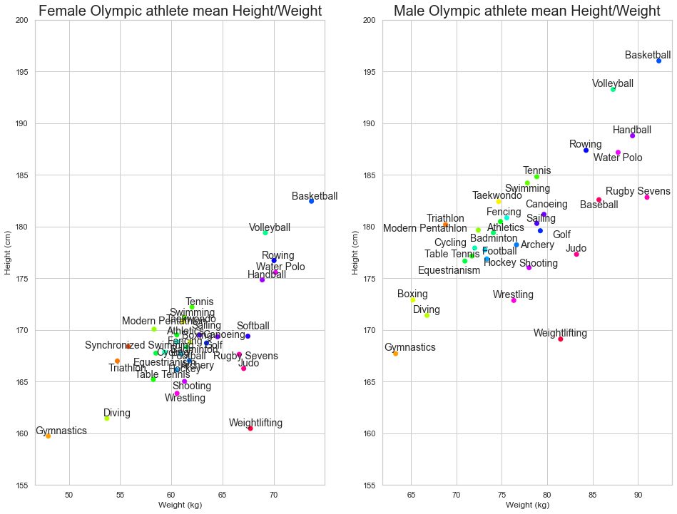
It appears that Olympic competition remains an option for a broader range of male physiques than female.
Let’s combine weight and height together and then account for age as well, to give us a better view of differences between Olympians in each sport. Conveniently, we can get a rough idea of body type using the BMI formula (weight in kilograms divided by height in metres squared).
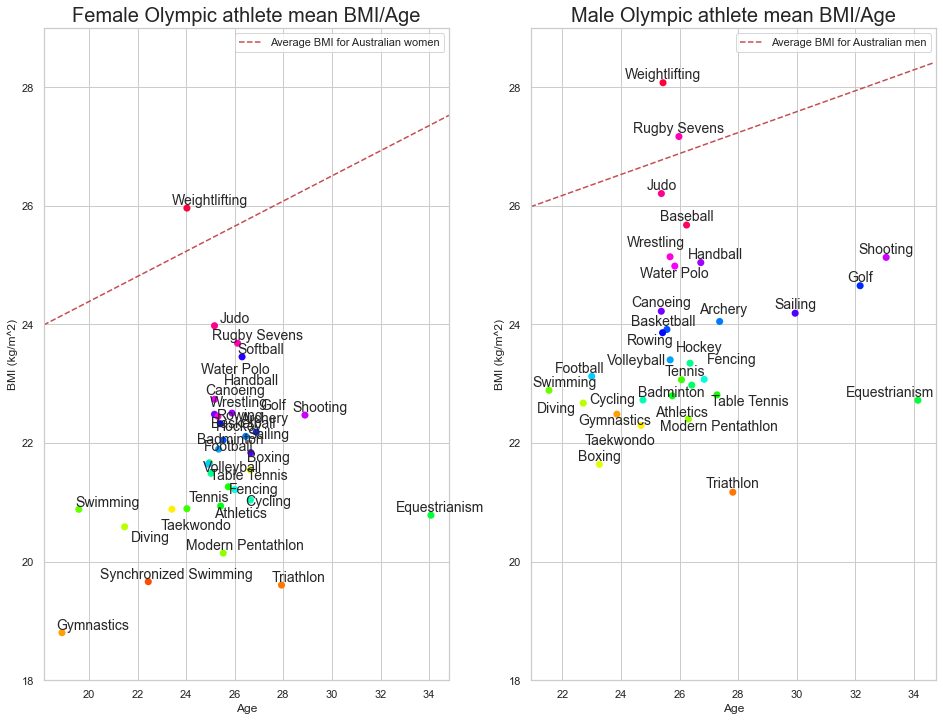
Wow some Olympians are young. I knew about Gymnastics, but swimming? Oh well, maybe there’s still time to learn how to ride a horse.
The average BMI of Australians is also shown in Figure 2. It looks like we might be a country of aspiring weightlifters!
The pursuit of faster, higher, stronger…
Together with winning gold medals, beating records is at the front of every athlete’s mind. And every Olympics, new world and Olympic records are broken across every sport. How is it that humans can keep running faster, jumping higher and pushing stronger? Some of this must be due to advances in equipment and techniques. But have there been advances in Olympic human bodies as well?
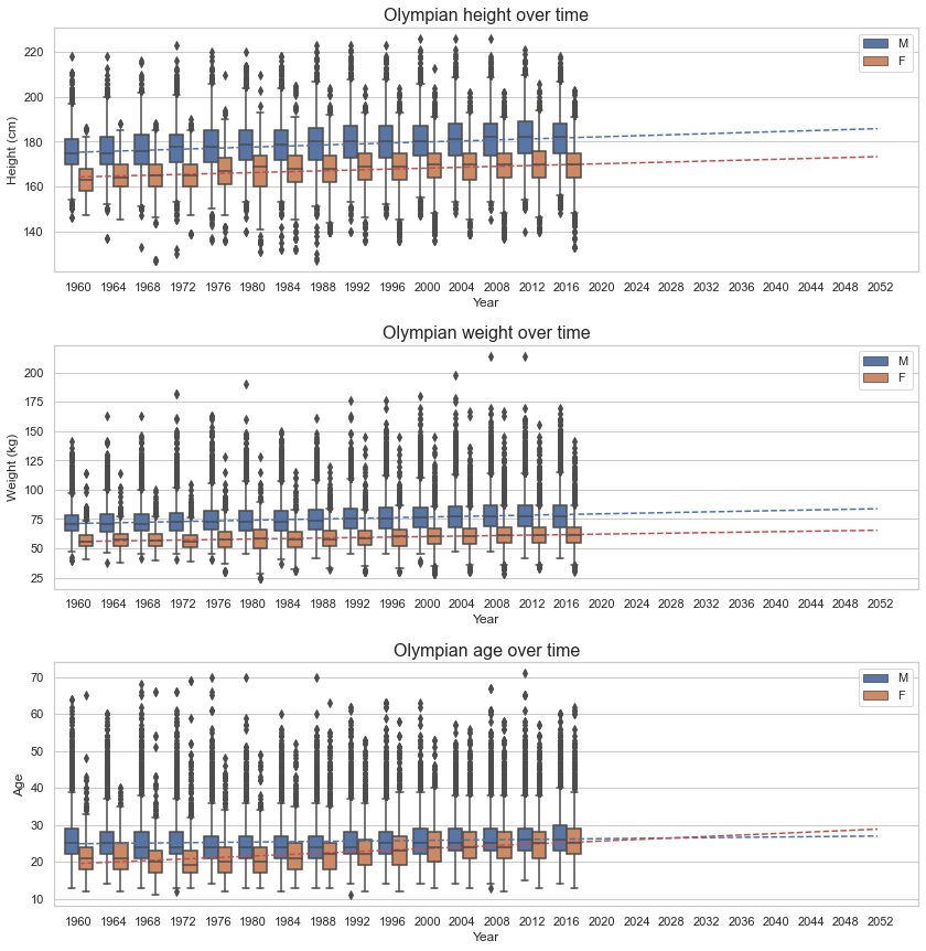
By 2050, it looks like the average Olympian will be a giant. At least average age is also going up, so there may still be time for some of us to get our skates on (literally!).
But why don’t we plot these all together? And as different sports? As it changes through time?
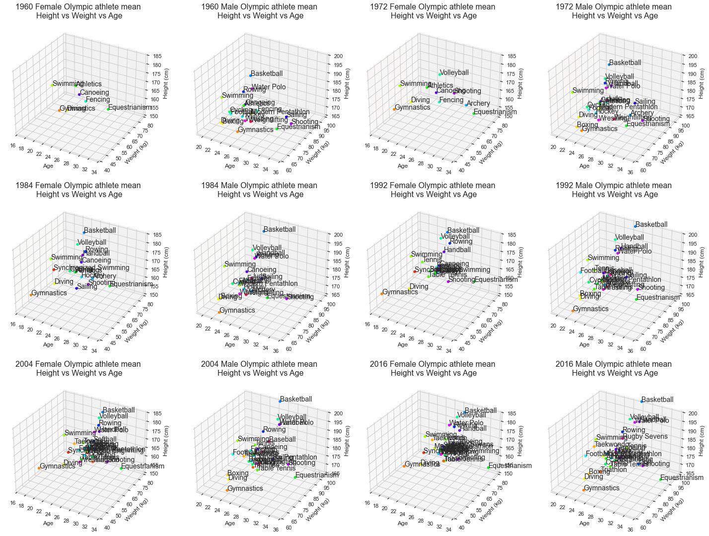
Ahhh, that’s why. As usual, we are limited by the number of dimensions perceivable by humans. Let’s be content with our two favourite spatial dimensions and enjoy some aesthetic animations of the Olympic physique over the years.
Physique trends – Athletics
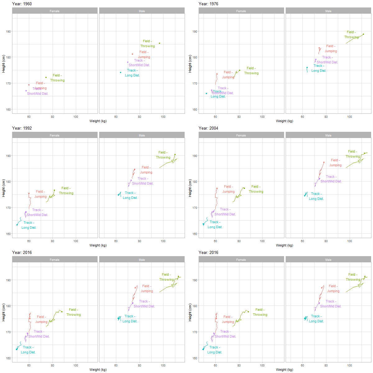
- Track – short/mid distance (<= 800m): taller and a little heavier for sprinting
- Track – long distance (>= 1500m): diverging from the sprinters, staying light is crucial
- Field – throwing (javelin, discus, shot put, hammer throw): bigger athletes throw further
- Field – jumping (high jump, long jump, pole vault…): taller and lighter = higher and further
Physique trends – Team ball sports
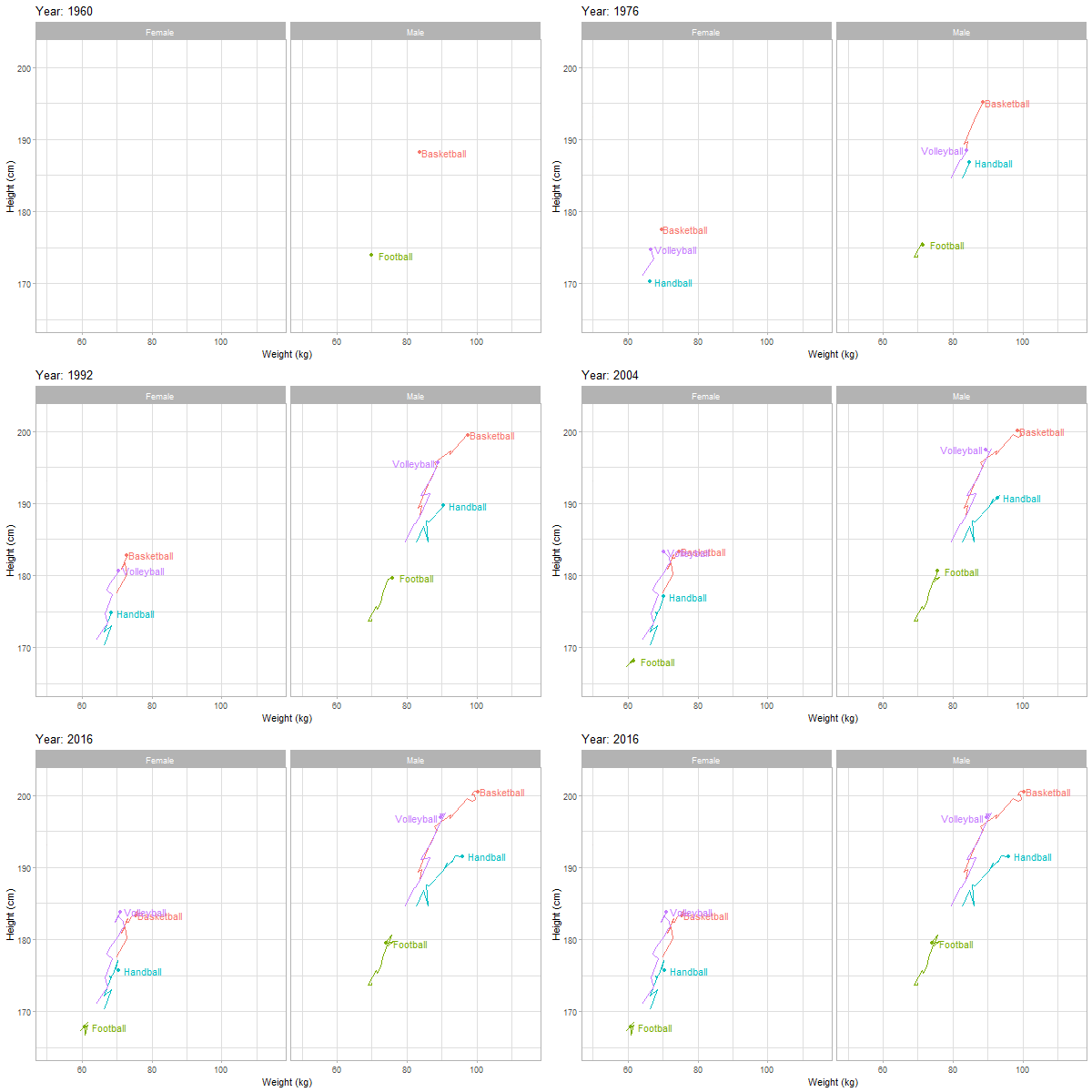
Shooting, blocking, dunking, spiking, heading… the extra height gives you the high ground advantage. It’s unsurprising that as the general population gets taller, the tallest among us end up qualifying for the Olympics.
Physique trends – Speed sports
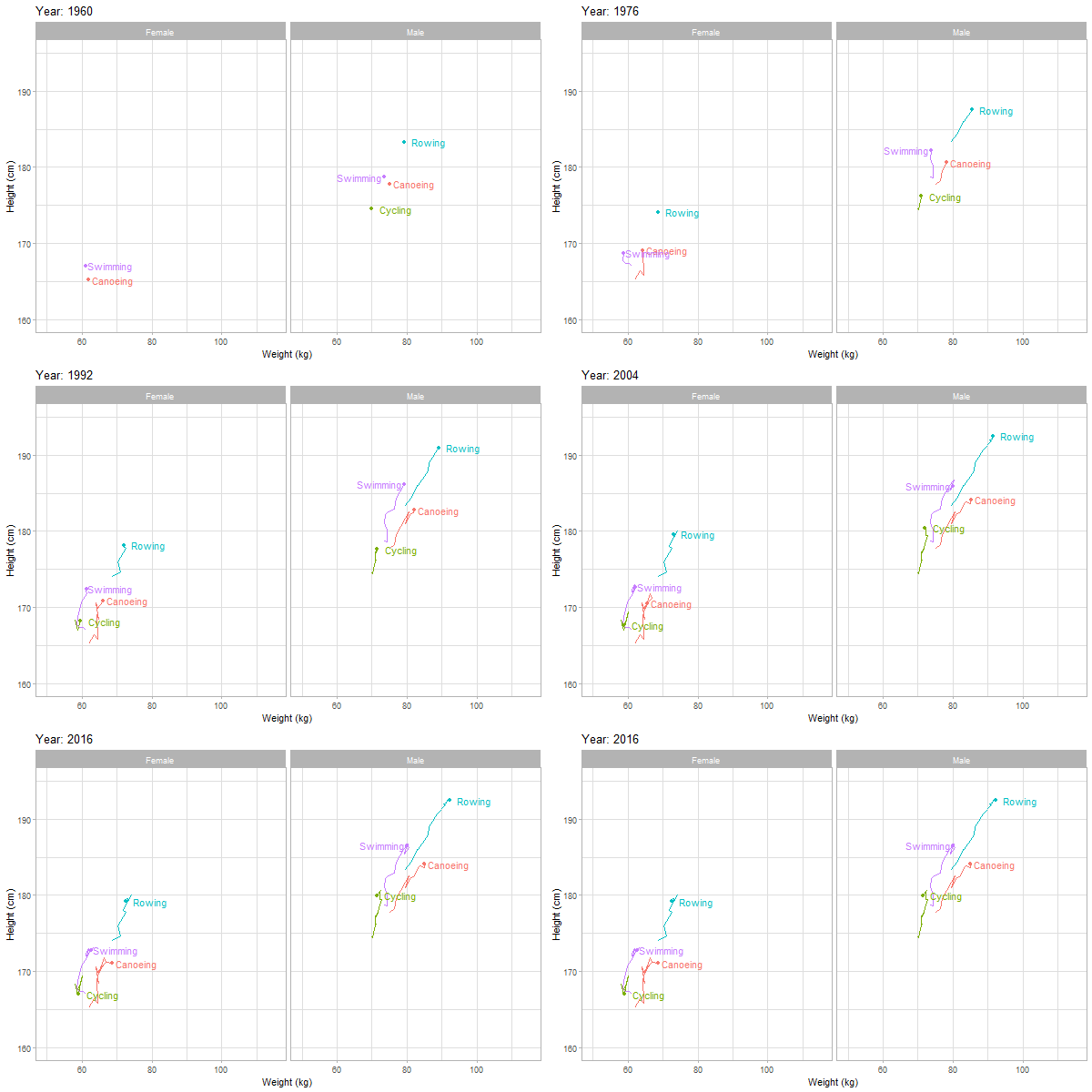
It’s a race to the top for our speed sport Olympians. It’s even more clear when the medal winners are separated from the other athletes:
Medal winners vs the rest – Speed sports
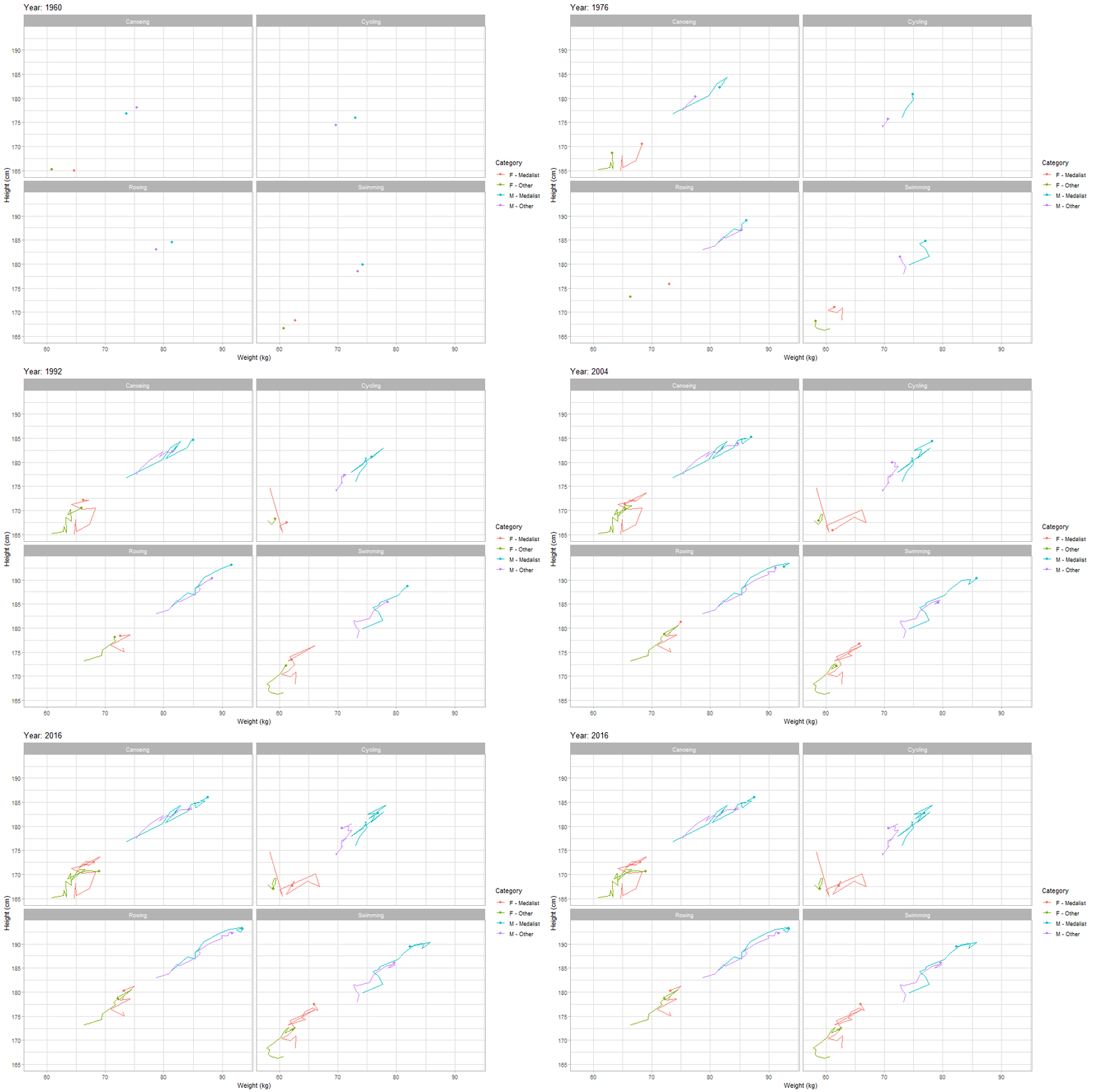
We can see that body type seems to matter a lot for winning in speed sports. The medal winners are the biggest, and over time, all the other competitors need to catch up to compete.
POLYmpic athletes…
Of all athletes at the Olympics since 1960, over a quarter have competed in more than one event.
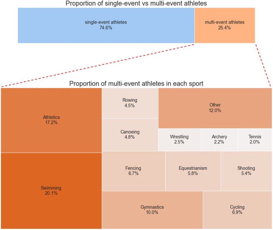
It’s unsurprising to see that the greatest proportion of multi-event athletes are in the sports with many events (like Athletics and Swimming).
What might be more surprising is that there are a select few athletes who compete in multiple sports! Here is how 0.09% of Olympic athletes competed in multiple different sports:
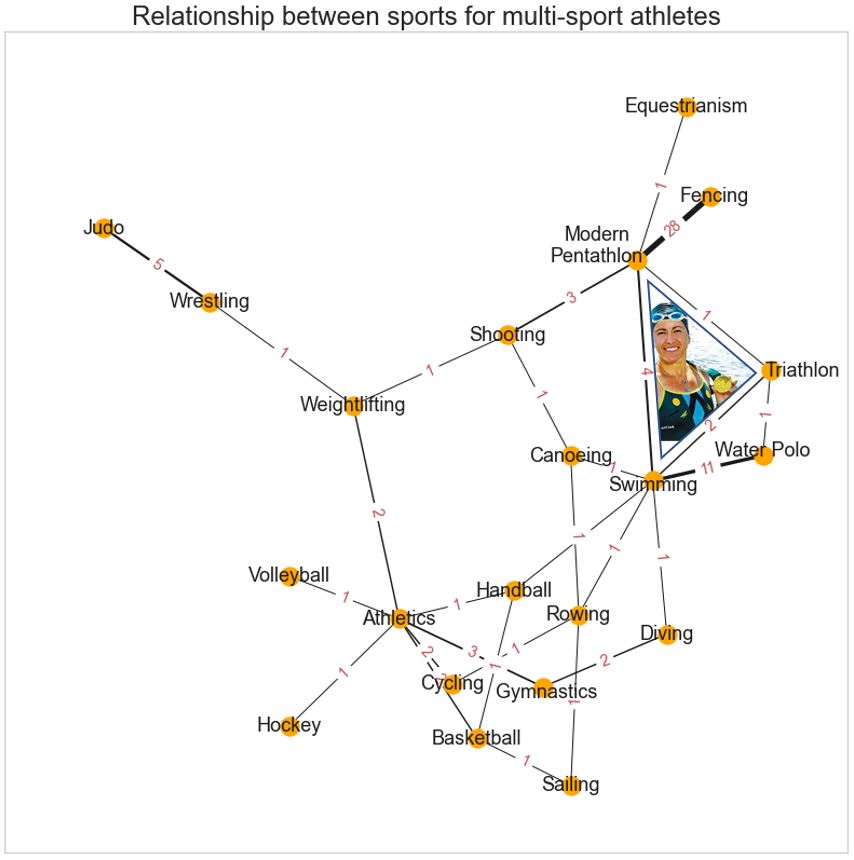
In this network diagram, each red number indicates the count of athletes who competed in each of the sports connected by the black line. The stronger this connection, the thicker the line. Technically, swimming, water polo and diving are all disciplines of the same sport of ‘aquatics’… But the graph looks more interesting with these separate!
Just by looking at this graph, you might be able to guess the bizarre combination of disciplines which go into the ‘modern pentathlon’ even if you’ve never watched it before!
In doing this analysis I also stumbled across the legendary Olympian Sheila Taormina from the US. She represented the US in three different sports over four different Olympics!
- Atlanta, 1996: Swimming (winning Gold in the 4x200m Freestyle Relay)
- Sydney, 2000: Triathlon
- Athens, 2004: Triathlon
- Beijing, 2008: Modern Pentathlon
She just couldn’t stop adding more sports! To celebrate her achievements, I have included her in the graph exactly where she would’ve wanted.
Reading tea leaves for Tokyo…
You might see a lot of people creating Tokyo Olympics medal predictions based on previous medal counts, number of athletes sent and even… knowledge of sports!? But today we’re going to have a go using only World Development Indicators (WDI) for each Olympic country. And not just the easy ones like GDP, population or life expectancy… we’re going to use indicators like cereal yield per hectare, proportion of seats held by women in national parliaments and road traffic mortalities per 100,000 people.
First step is prepping the data… And after some simple matching, lazy cleaning and flashy pivoting, our data includes:
- 205 countries;
- 16 Olympic years (1960-2020);
- one row per country/year combination (~205 x 16 rows because of some historical non-participations and non-existent countries);
- a medal count for each country/year combination; and
- data for 274 socio-economic indicators.
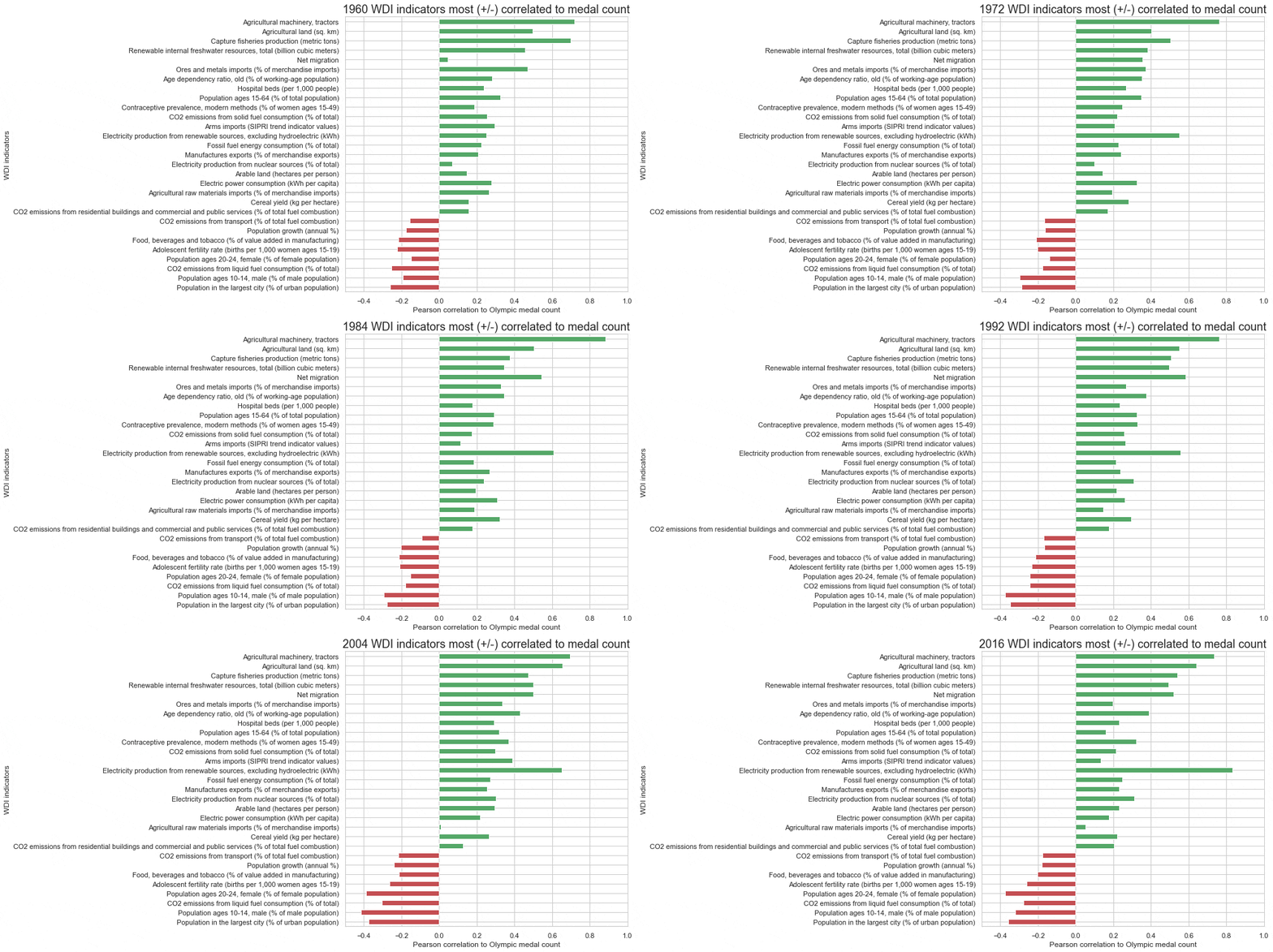
Personally, I think including country as a variable would make this too easy, so let’s drop country from being a predictor – and year while we’re at it. And now a first look at some correlates to medal count:
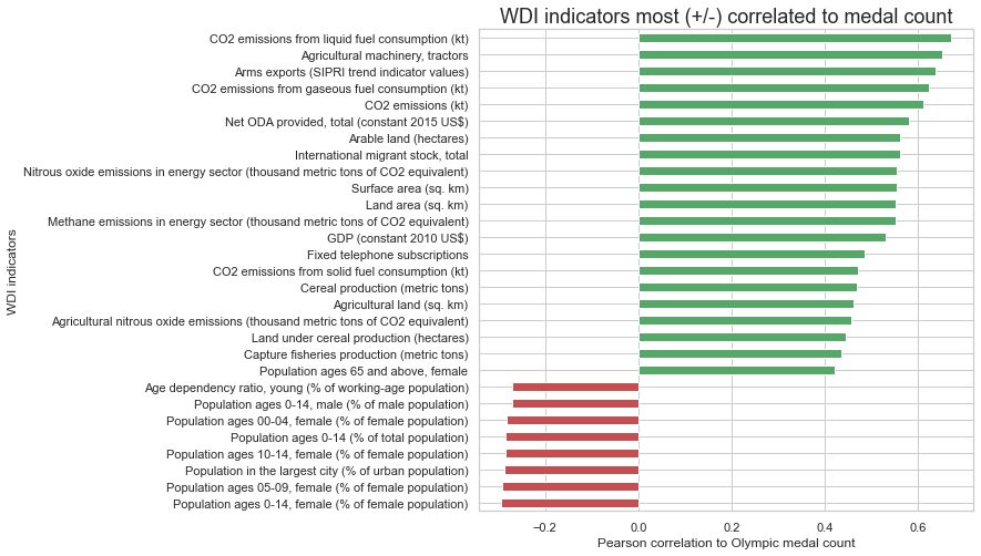
While I appreciate the World Bank is extremely thorough in its tracking of variables, for our purposes many of these indicators are measuring essentially the same thing. When modelling, multicollinearity can make model interpretation more difficult, so it’s often a good idea to remove variables that are highly correlated with each other (debateable). In any case, my aim is to use the fewest, strangest variables as possible so let’s overzealously strip out 163 predictor variables with over 0.6 correlation to each other.
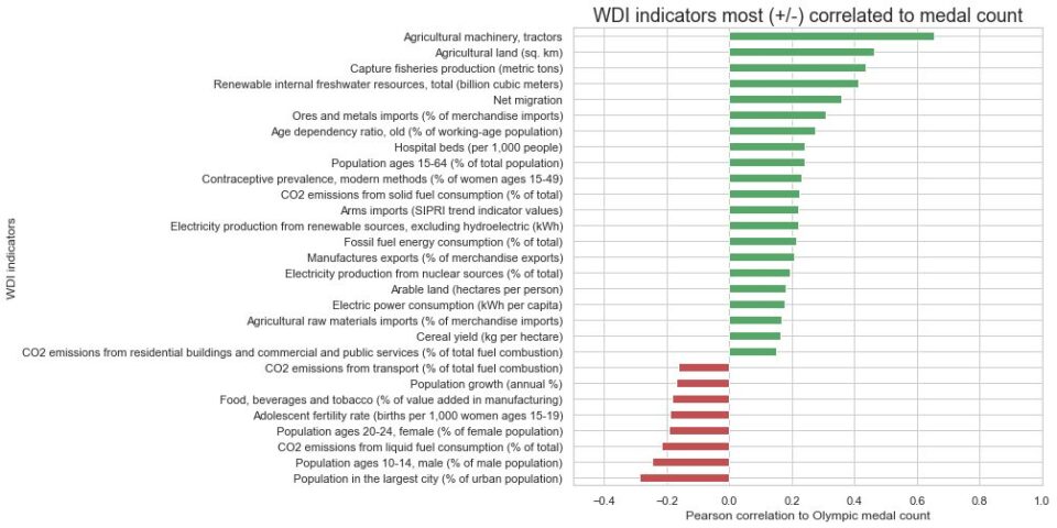
This chart is also zoomed out so we can see more of how these variables change over time:
I feel that any serious feature engineering goes against the spirit of this challenge, so let’s just throw everything into a gradient boosting machine (GBM) and see what happens.
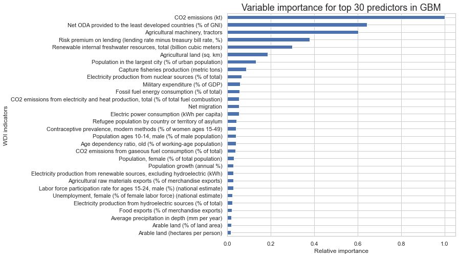
Variable importance plots are one of the most useful tools for interpreting GBM models. The variable importance represents the relative influence of each predictor and relates to the reduction in squared error given that predictor’s inclusion in the model.
Looking at the plot, it seems that the top three variables are doing most of the heavy lifting. I think we’ve found the perfect variables for prediction! Let’s build a new GBM with:
- annual CO2 emissions
- official development assistance (ODA) contribution to developing countries
- number of tractors
Here is what the final stats of our model look like:

I’ve been using grid searches for hyperparameter tuning with selection criteria as mean squared error of the combined cross validations (folds based on Olympic year). This method optimises a model for predicting the medal tally given data from every other year. One could make an argument that we should set the model validation to train only on data from years prior to each target. But you don’t care about that, let’s see the predictions!
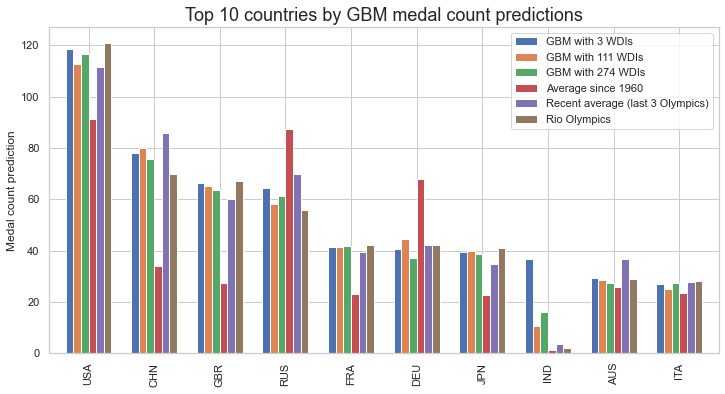
When you weren’t looking, I also produced the predictions for GBMs with the other two sets of variables (the full set of World Bank WDIs and the remaining WDIs after stripping out variables for multicollinearity). At least for these top 10 countries (by GBM prediction), the medal estimates look reasonable.
We seem to have captured the general growth of medals in most of these top countries (as compared to historical averages) which is a good sign! The model has also identified a reduction in Russian (RUS, but at Tokyo ‘ROC’) medals since the fall of the USSR and something similar for Germany (DEU) that could be related to the historical impact of the East/West split. Unfortunately, it looks like the model has completely missed mark on India (IND), but we’ll just have to wait and see!
In a few weeks, we’re getting the YDAWG Analytica team together for a post-Olympics article. I’ve locked in a full list of my predictions for every country and in that article I’ll include a prediction evaluation and debrief.
Thanks for coming on this data journey with us! Enjoy the rest of the Olympics (we hear the sport can be entertaining too).
CPD: Actuaries Institute Members can claim two CPD points for every hour of reading articles on Actuaries Digital.


